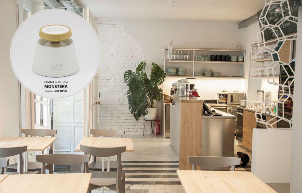

The voting took place between the 15th of December 2016 and the 11th of January 2017. Among the 1804 cast votes in the web survey (one vote per IP), the most went to Monstera bistro (27 percent), which now joins the 2014 Space and a Half - the Pivovarna Union beer hall - and the 2015 Space and a Half - Cat Caffe. MMC’s readers put Pišek Bar in second place (14 percent of the vote), and in third was Nostalgija Vintage Caffe (13 percent). For the full results of the vote click HERE.
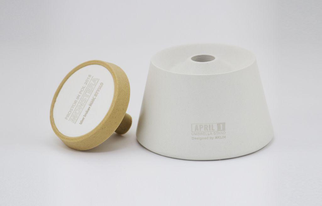
This year’s symbolic prize for best interior was created by the AKLIH design studio, and is a slightly adapted stand for umbrellas called April.
The interior design gives way to food and Bine
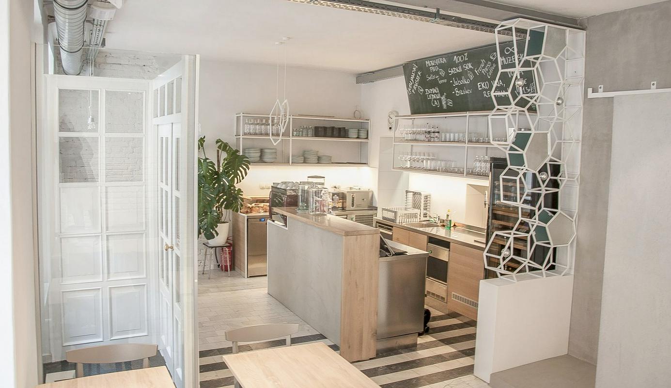
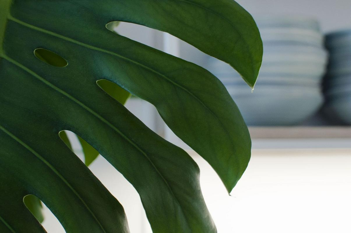
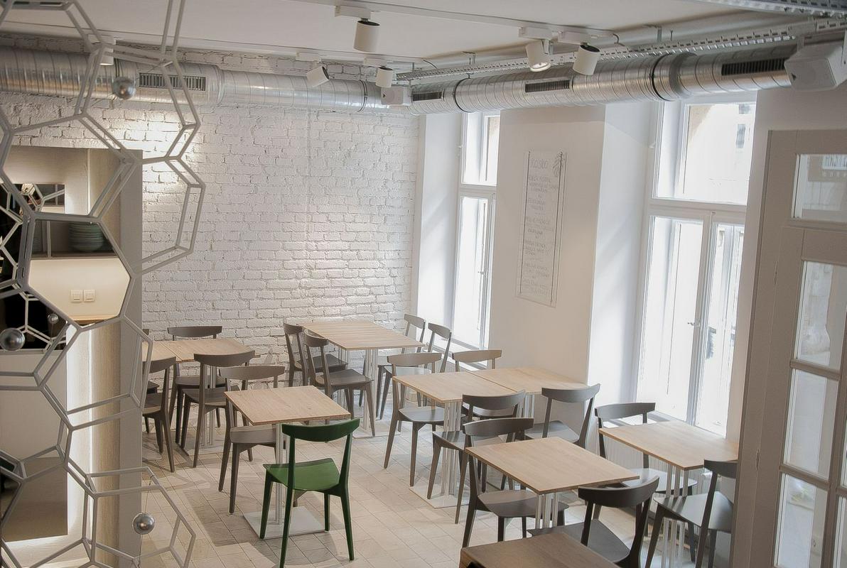
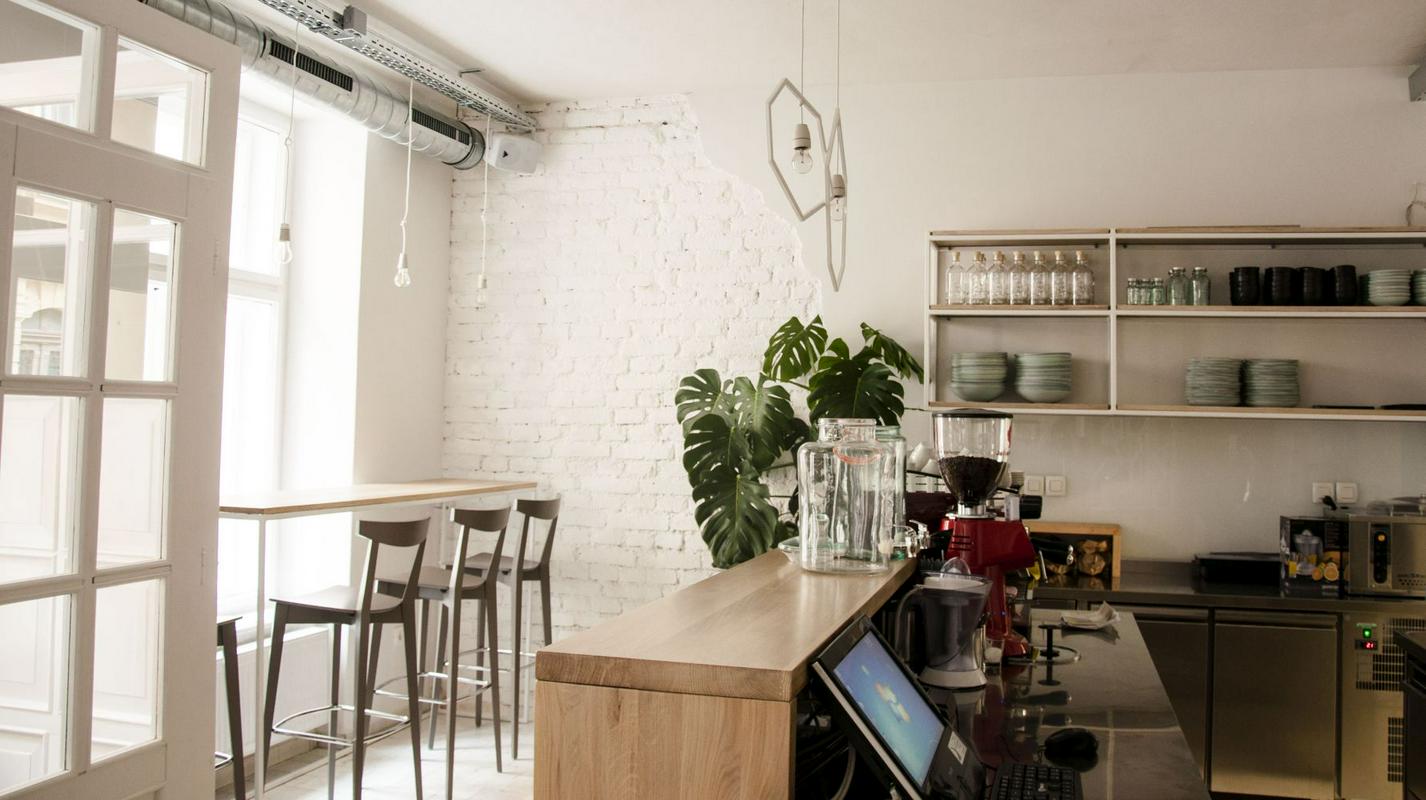
The architect responsible for the interior of Monstera Bistro is Maja Stamenković. She says her interior design concept gave way to food and Bine, the chef. The only demand the chef had was to find a place for the Monstero delicioso - a tropical plant under which Bine played as a child with legos in the 1980s. The plant has large ripped-looking leaves and is a typical example of the botany of Central and South America. The monster plant experienced a renaissance in the offices and apartment buildings of former Yugoslavia, filling up the empty spaces from floor to ceiling.
"When I started researching the plant out of curiosity, I discovered how interesting it was and that it has very delicious fruits... as if mixing up a banana, pineapple, kiwi and strawberries, all that together. It has an undefined and very unique taste. And I said to myself, that’s it, that’s exactly my style of cooking - a bit quirky - I mix everything together into one good whole," says Bine Volčič, whose goal is to prepare a first-class house dessert out of the plant’s delicate fruits.
Geometrical elements
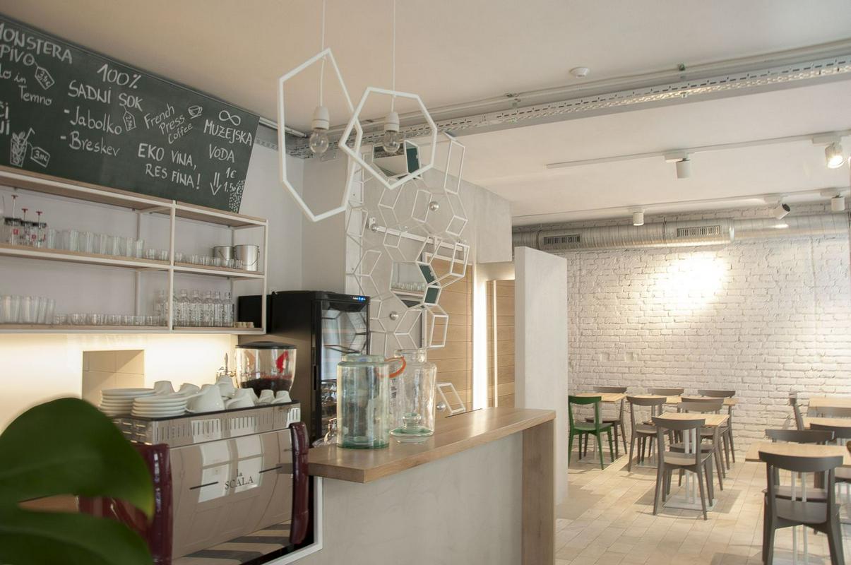
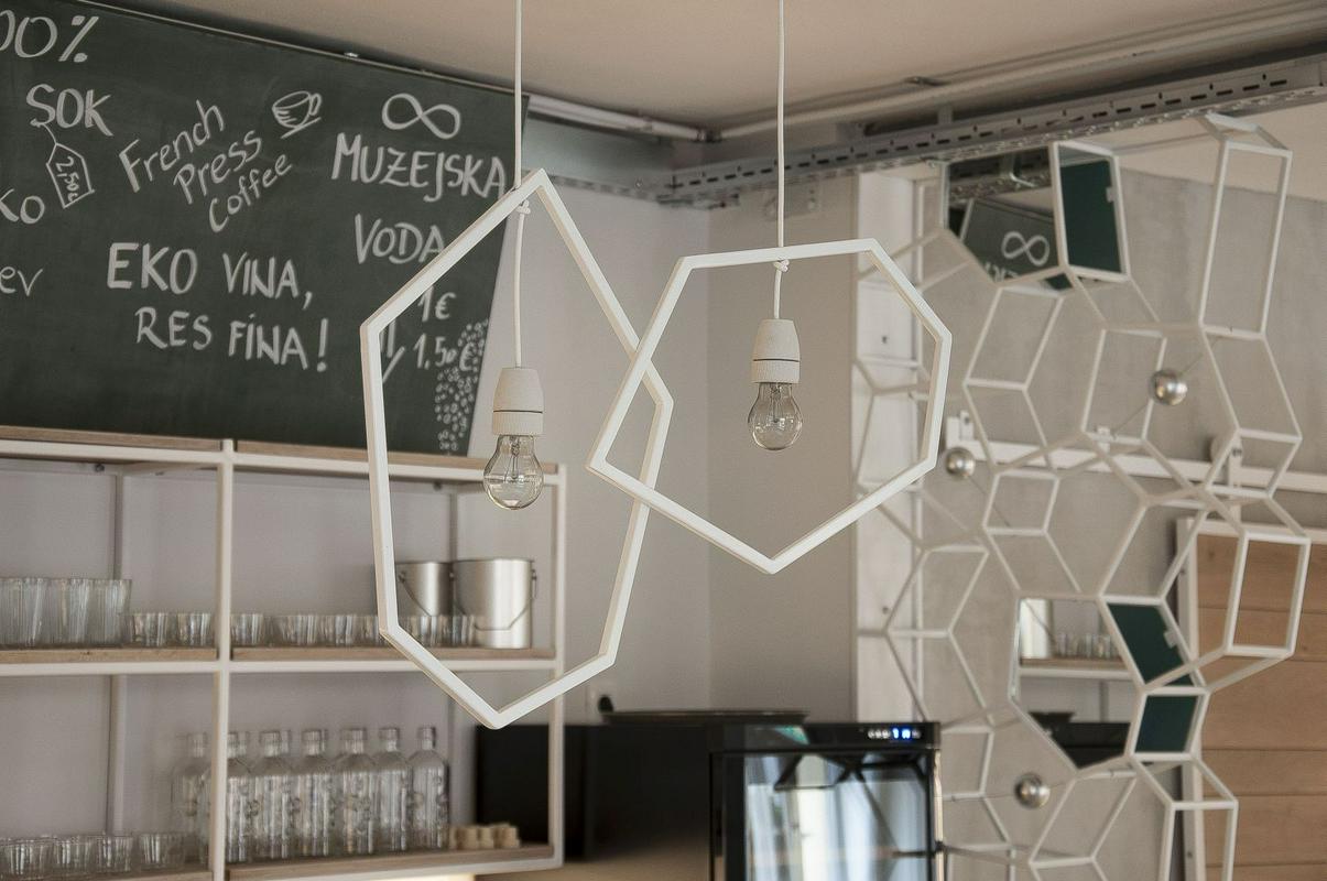
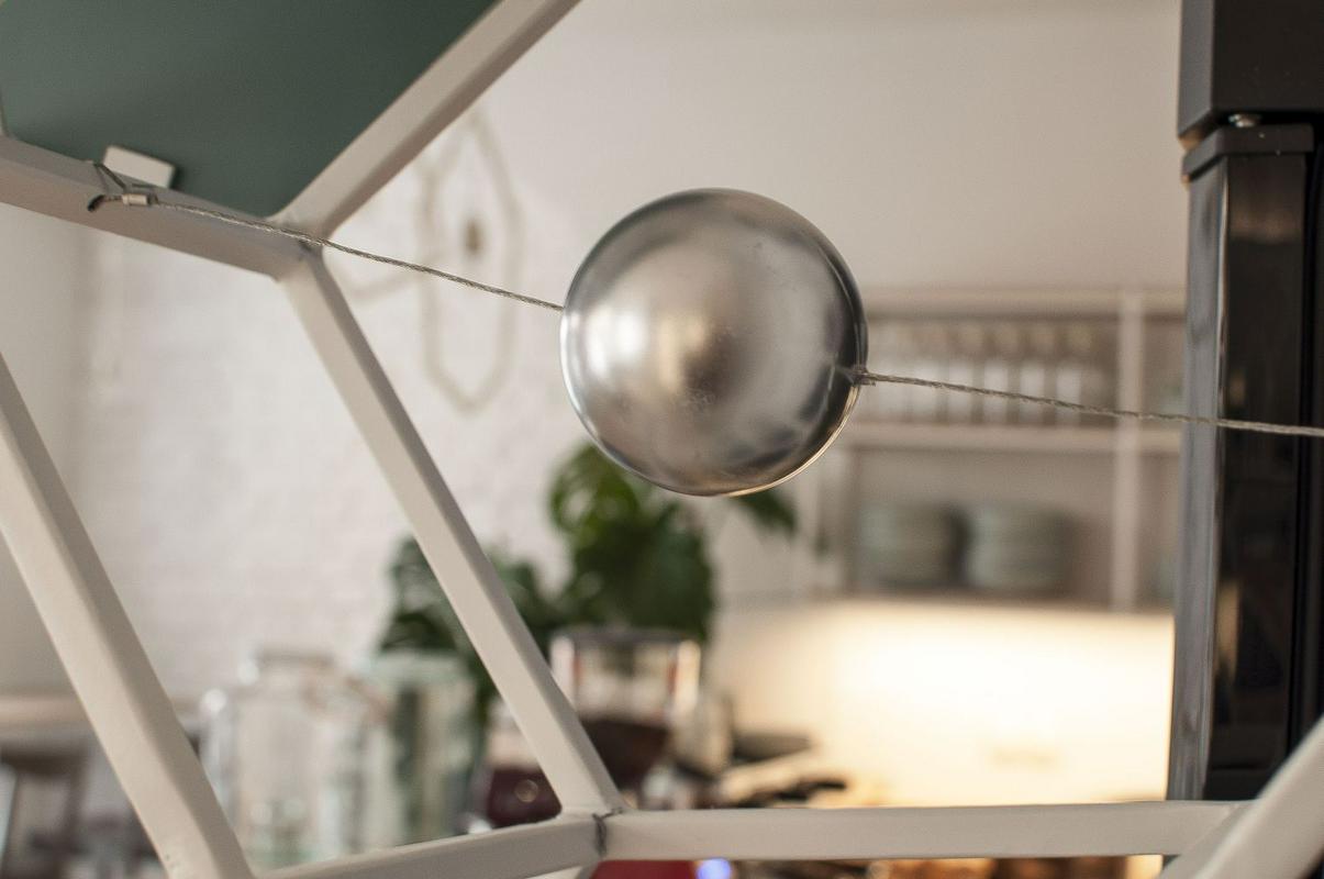
Apart from the honorary position the green plant has, right next to Bine’s working area, the attentive observer will also notice, among all the grey chairs, only one green chair. "The different nuances of green symbolize the plant in its different stages of growth. When it is small, it has a yellowish light green colour. Later it becomes darker, darker, darker," explains architect Stamenković. One will also notice the geometric lights in the shape of the monster plant’s fruits, and an installation of hexagonal compartments created by the architect herself, which have small silver balls in the middle sections, similar to the fruit of the Monstera deliciosa. An interesting detail in the restrooms are the special Dandelion (Marrakech Design) ceramic tiles over the sink, which show the monstera leaves, while the lines symbolize the leaf perforations.
Traces of history in every corner
The architect has made use of a few elements the ground floor of the building made in 1897 had in a very economic way. The space was first used for residential purposes. It was later transformed into an architects’ bureau, and then a restaurant. The architect has preserved the marble floor, adding some concrete to it to highlight the current ground plan. The brick wall has been painted white. Stamenković also decided to keep the flower patterns which were discovered while peeling one of the slightly hidden side walls. To add to the nostalgia she put a silver Meblo hanging light in that corner "because it’s retro and it fits into this concept".
