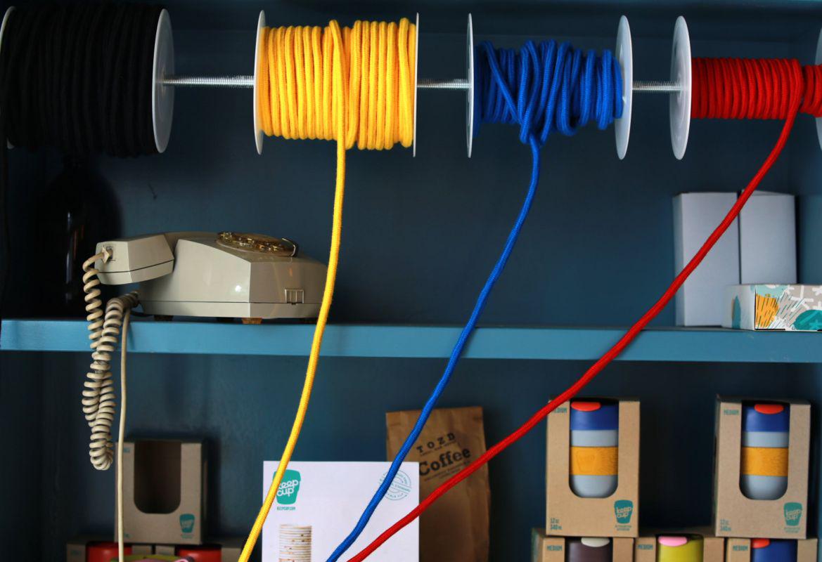
I didn't want the usual cables, so I thought of the cable used for irons for ironing clothes, and found a firm in Domžale which still produces ropes of such design. I asked whether it would be possible to insert wires, and the result is a product we sell here as well.
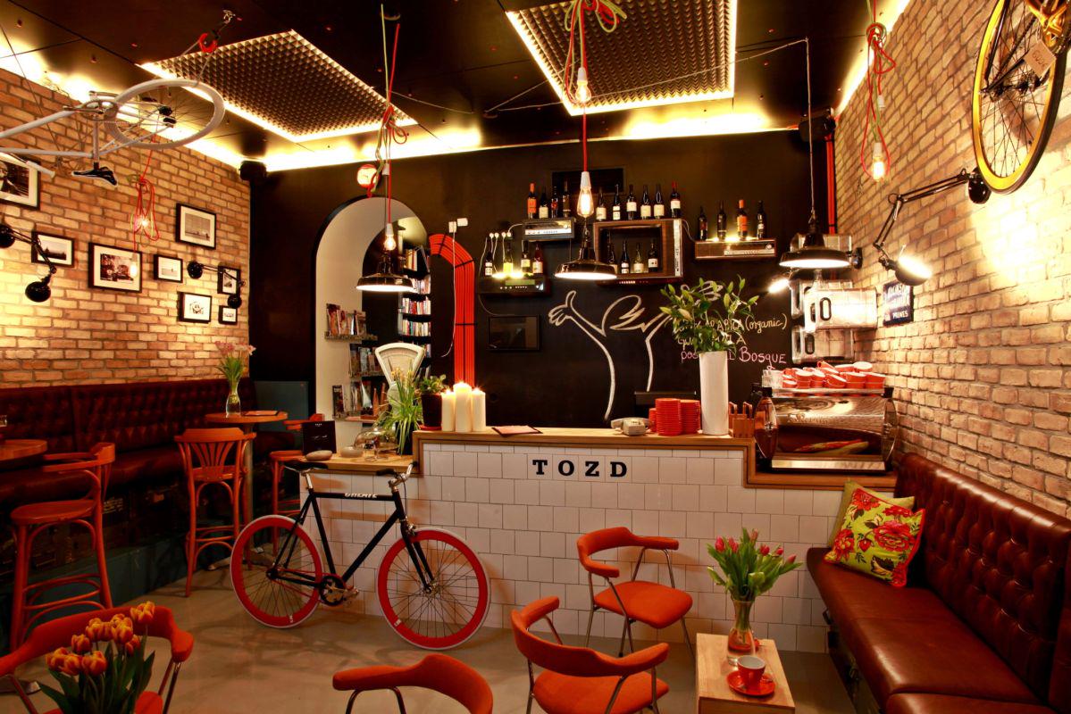
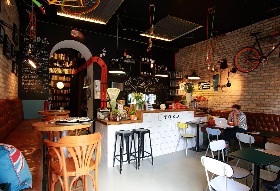
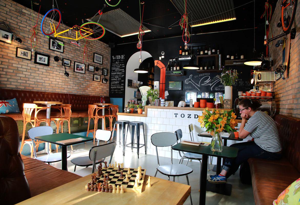
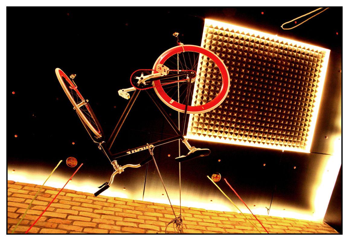
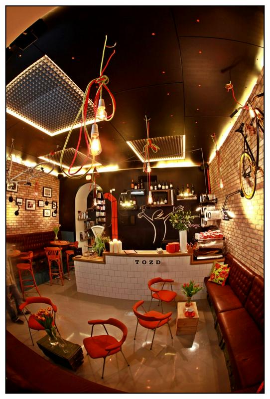
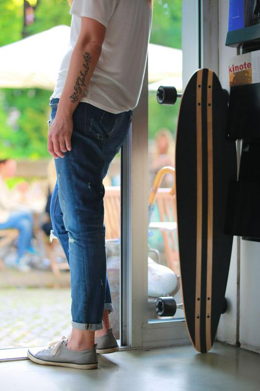
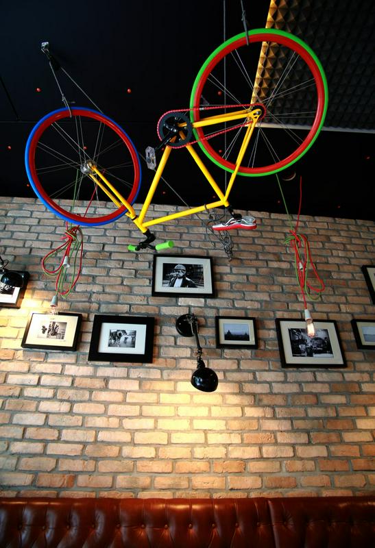
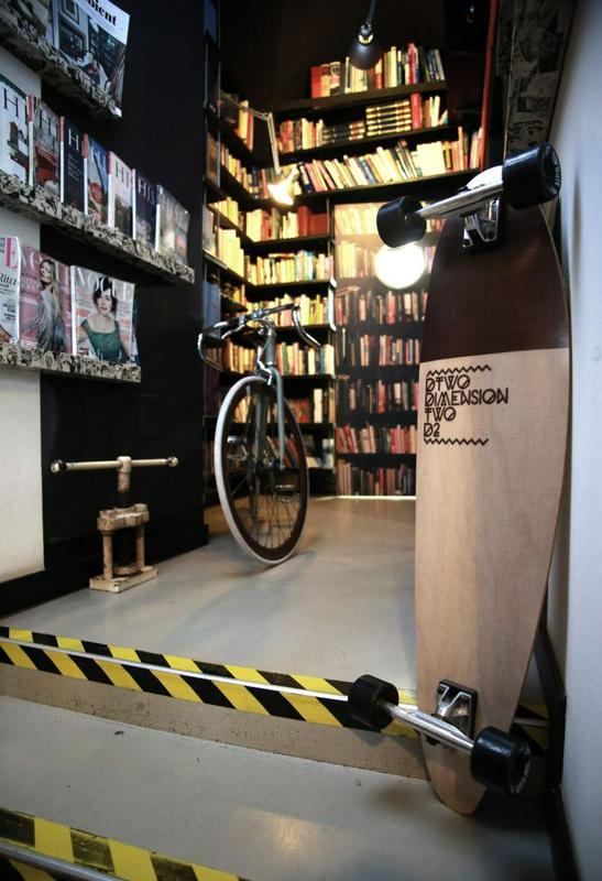
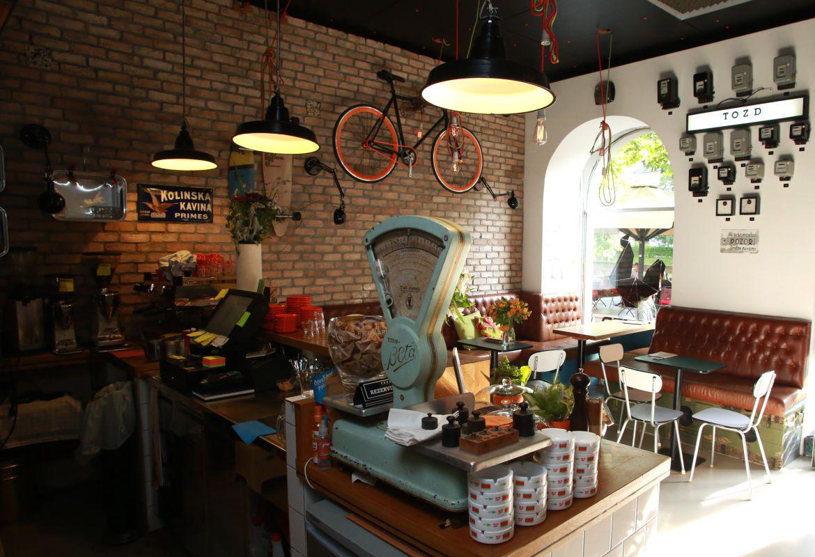
As soon as you enter TOZD, your attention is immediately attracted by a colourful 'muslauf' bicycle hanging from the ceiling. The next attraction for your eyes, before you even notice the other details of the bar in the old part of Ljubljana, is a 'longboard' on the opposite wall. Somewhere in between, your eye stops on the green-yellow cables with bulbs hanging from the ceiling. "It's a replica of the Edison's first light bulb with filament," explains Robert Henigman and points his finger at the black-and-white photographs on the brick wall, lit with three black wall lamps.
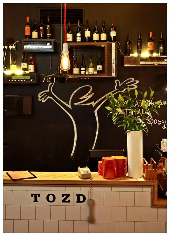
Black is one of the basic colours used in the interior of the bar (joined by orange, as we will explain later). The black colour is repeated on the central wall behind the bar, or "the soul of the bar", as Robert claims. The wines offered, and the specialties of the day are listed on it in white chalk. In the past the wall was decorated by the image of the Italian cartoon character, the constant nag La Linea.
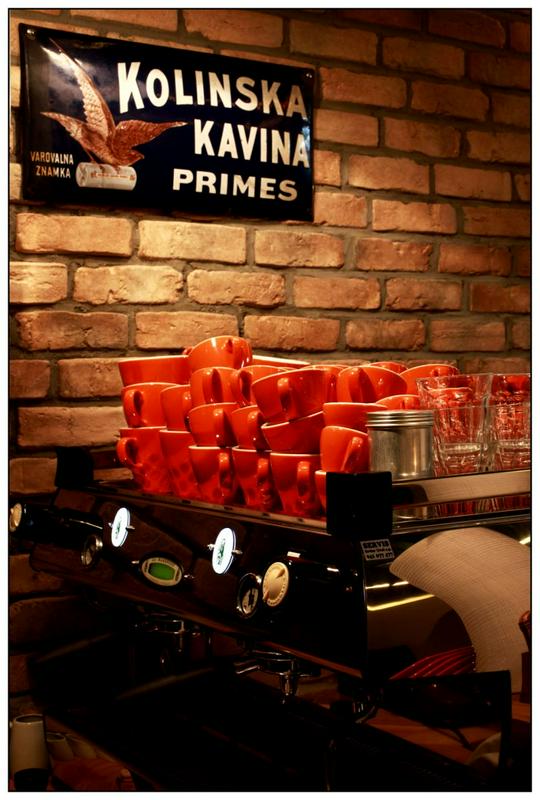
"The characteristic TOZD cup is orange"
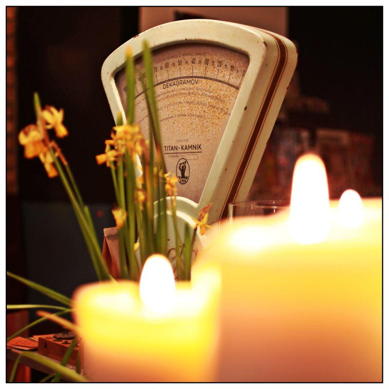
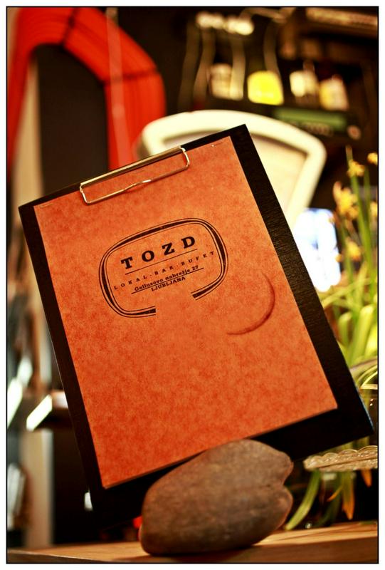
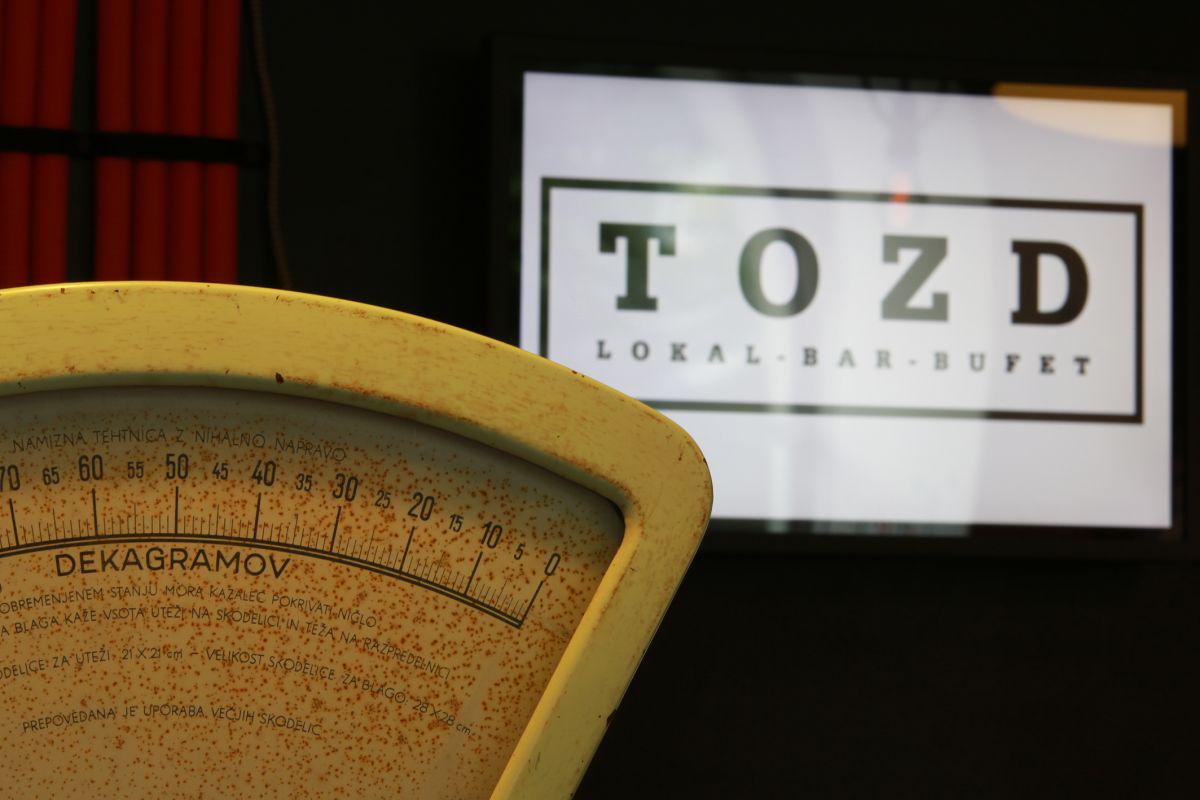
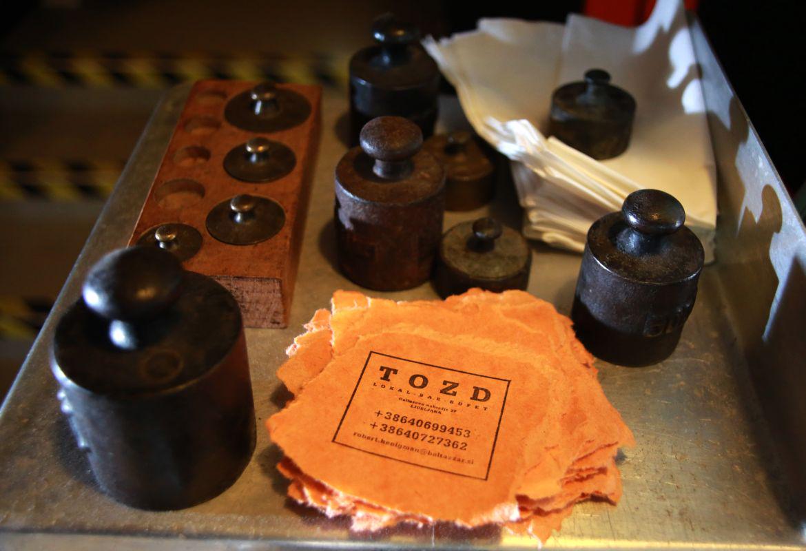
TOZD is a very male bar. Yet the prevailing presence of testosterone is softened by the light pink hydrangeas from the garden of Robert's mother. And old kitchen scales 'beta', produced by the company Titan Kamnik during the years 1933 and 1960. In the back of the bar you will find a miniature library, operating on the principle give-take. There is also a menu in orange in the form of notebooks used in school in the 70s of the past century, into which wrote the "baby boom generation" – encouraged by a teacher's educational slap across the hand with a ruler. The orange coffee cups were made for TOZD by the legendary Iker Zagreb. "The characteristic TOZD cup is orange," Robert says.
Simplicity, warmth, industriality
The design was inspired by simplicity, warmth, and industriality, and the main principle – recycling wherever possible, and do as much as possible with a limited budget. "Our basic idea was to create a meeting place for a wider circle of friends. I wanted to create a kind of living room into which I could invite everybody, and where other people would come as well," Robert explains.
He got the idea for TOZD in Australia, where he lived for some time. He says that they don't consider it strange for a penniless young chef to open 'a hole in the wall' – meaning that they rent a place which had never been used before, and start a restaurant; all the necessary work from wall painting to decorating is done by themselves, which gives the place its 'soul'.
Few architectural elements
The same happened with TOZD, in harmony with the original meaning of the acronym (temeljna organizacija združenega dela= Basic Organisation of Associated Labour) – today the acronym stands for Tovarna, oplemenitena za dizajn (Factory Refined for Design); Robert's friends helped with the renovation, in the spirit of 'associated labour'.
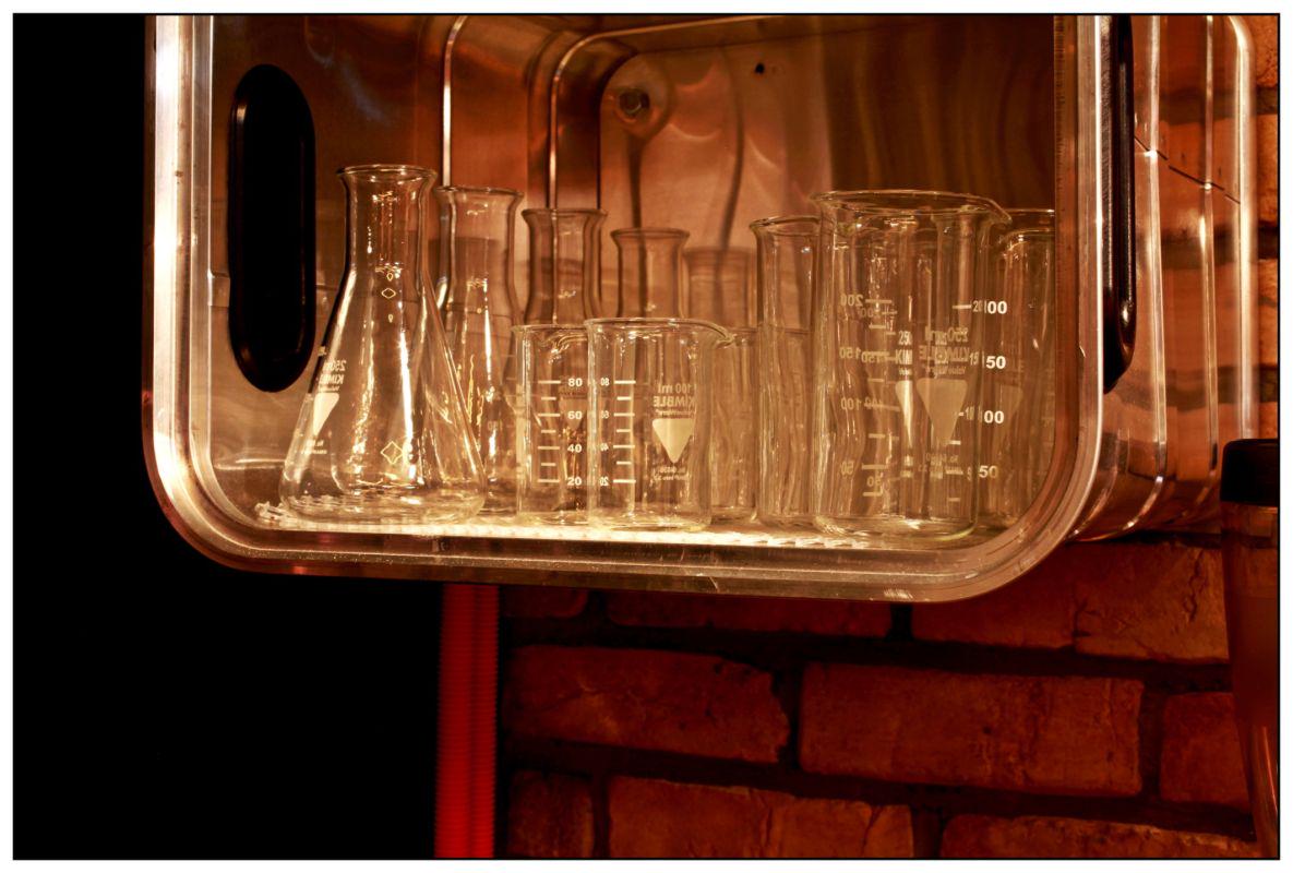
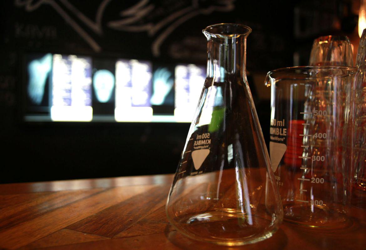
There are very few architectural solutions in the bar. The architect Dalija Tanjšek only drew the ground plan, parquet, and the bar counter which needed panelling. And yet TOZD turned into a bar with presence, and humour, and it shows the idea has been well thought through. "We had the idea where and how to put the main things, while the decisions on the details came spontaneously," Robert says. The old radio and TV sets acting as shelves on the black wall behind the bar counter came from a flea market. The chairs came from the same source, and the Venus installation was made of discarded electric meters. Filtered water is served in erlenmeyer flasks.
The only constant is change
The TOZD specialty is that it is constantly changing. One of the reason is that everything in the bar is for sale, "with the exception of personnel", warns Robert. You can buy anything you want – from the bicycle to the longboard, photographs, or the colourful cables for the bulbs. "I didn't want the usual cables, so I thought of the cable used for irons for ironing clothes, and found a firm in Domžale which still produces ropes of such design. I asked whether it would be possible to insert wires, and the result is a product we sell here as well." But the Slovenian audience is not yet perceptive for such a concept – a bar which at the same time acts as a sale-exhibit space, Robert claims.
Katja Štok, Foto: Matic Bajželj
translated by G. K.
I didn't want the usual cables, so I thought of the cable used for irons for ironing clothes, and found a firm in Domžale which still produces ropes of such design. I asked whether it would be possible to insert wires, and the result is a product we sell here as well.


